Paul Hammant's Blog: How Google makes a consistent top-navigation across multiple apps
TL;DR: Google has a shared app-launcher flyout for different applications. It is injected into pages on the server-side (not client-side).
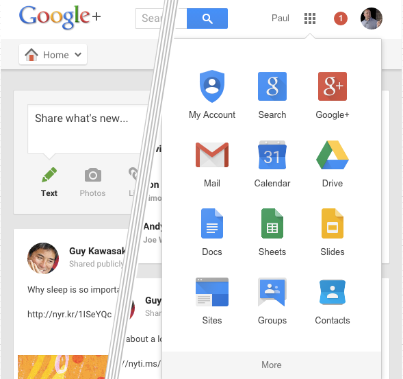
Google has dozens of applications that go live on different release cadences. Different application teams can use different languages, and make different server & client-side framework choices. For many apps, the top inch of the page looks fairly consistent. Let’s focus on the applications that are available to you if you’re logged in, by clicking the apps icon (a 3 x 3 grid of dots) in the header:

That’s for the Google-Plus application, but flyout is almost identical for all the applications. It looks subtly different due to each application having slightly different CSS. Here’s a breakdown of how each app places the flyout into the page:
| App | URL | Flyout Implementation |
|---|---|---|
| My Account | myaccount.google.com | HTML |
| Search | www.google.com | HTML |
| Google+ | plus.google.com | HTML |
| Gmail | mail.google.com | One element in a Javascript array “GLOBALS”, containing HTML |
| Calendar | www.google.com/calendar | HTML |
| Drive | drive.google.com | HTML |
| Docs | docs.google.com/document | JavaScript var “DOCS_homescreen_one_google_html”, containing HTML |
| Sheets | docs.google.com/spreadsheets | JavaScript var “DOCS_homescreen_one_google_html”, containing HTML |
| Slides | docs.google.com/presentation | JavaScript var “DOCS_homescreen_one_google_html”, containing HTML |
| Sites | sites.google.com | HTML |
| Groups | groups.google.com | HTML |
| Contacts | www.google.com/contacts | HTML |
Secondary apps (below the “more apps” line) are like so:
| App | URL | Implementation |
|---|---|---|
| Youtube | www.youtube.com | No App Flyout |
| Maps | www.google.com/maps | JavaScript var “APP_OPTIONS”, containing HTML |
| News | news.google.com | HTML |
| AdWords | adwords.google.com | No App Flyout |
| Photots | photos.google.com | HTML |
It’s the same broad implementation
It appears that docs, sheets, and spreadsheet are one application (on docs.google.com), or at least follow a very similar design. All three have the same HTML encoded in JavaScript variable. Gmail and Maps also use JavaScript for the injection of the “apps” flyout into the DOM, but each implement it differently. All the others have the HTML for the flyout in the DOM as it is sent from the server. Even the ones that are encoding the HTML fragment as JavaScript are doing it server-side. Nearly all of the HTML for the flyout is the same regardless of app and logged in user. There are some elements that are personalized (the links to Google+ have your ID), so the injection isn’t global for everyone, it’s for you. These apps are single-page (ish) meaning there’s not a lot of redundant page rendering per app per user.
It’s clear Google have a component linked in to each app, or a service that’s invoked per page-impression. Given Google’s tooling around their mega-trunk allows them to compile in dependencies easily my money is on the former and it’s not a service.
The clicking on an app icon, causes a new window or tab to open. Maps is the exception though - it opens in the same window/tab.
The variable names in the source, lead me to believe that Googlers refer to the whole thing as “one google bar”.
Why not in JavaScript?
Google are so good at JavaScript that you wonder why the implementation for this wasn’t a clever client-side JavaScript technology. Something that had a partial or lazily loaded thing. What they’ve done feels like a lowest common denominator solution, as it works well for them, they’ve no need to change it. There’s also the possibility that nothing in the header inch, will conflict with JavaScript framework choices made by individual application teams. There’s also no use of iframes to do this - even though it could be possible and it would lower the page size.
When WebComponents is been embraced everywhere, Google implementation could change of course.