Paul Hammant's Blog: Another Architecture Diagram
See also the previous blog entry eight months ago on architecture diagrams here
Here’s something I’ve previously drawn up (and now massively anonymized). I’m graphical and always need this type of thing for new clients. It gives me a view of production from a system/process/container point of view. This one is a pre-cloud implementation for the group I previously consulted with (who are fully in the cloud now). UAT was similar enough but had a reduced hardware allocation. Not only smaller specced units but less horizontal scaling. UAT was also stymied by the partners and clients sometimes not having a UAT environment of their own for “us” to connect to. Or one that was crap in terms of robustness. The client did not have a QA environment (back then).
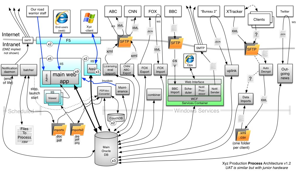
Boxes are at least processes. Lines are TCP/IP or file I/O. Numbers in circles are indications of horizontal scaling or duplication on some basis.
Typically, these diagrams are the result of many conversations. I’ll exhaust Person A, with questions (and use a large sheet of paper). Get that into OmniGraffle then go back to them. “Is this a right”, I’ll ask, and at some point it is, so I’ll go to person B with a print out (a large sheet of paper again), and ask “what’s not quite right”. The diagram will morph a lot through the first three people. At some point, I stop printing and work directly in OmniGraffle because the mods are fewer. At some point it’s done and even Person A likes it (which always pleasantly surprises me).