Paul Hammant's Blog: Collecting and Charting Multi-Module Nx Jest Coverage
Directed graph build technology Nx can run Jest test suites for multiple modules in one go. If you add --skip-nx-cache --all it will run all the Jest suites in the repo. You might have tacked --codeCoverage --coverageReporters="json-summary" onto the command, in which case coverage data will have been collected at the same time as test results to JSON files. Multiple JSON files for multiple modules leaves you wanting them combined for further use. One such use could be a chart that has lines for each module showing coverage changes up or down over time. Such a chart would allow management to work out where additional tech talent could be added to the team to get coverage up. Up to say 80% and not higher if we’re trying to be reasonable.
Some prior work
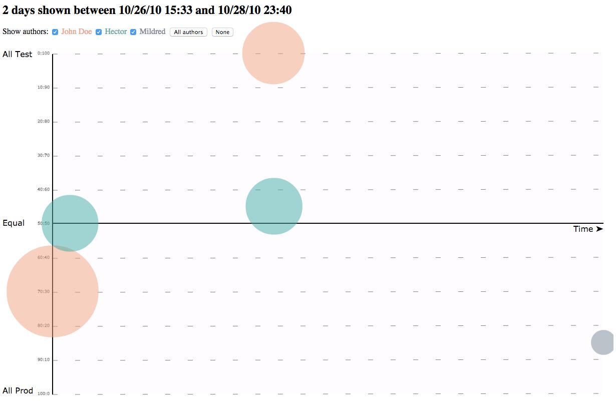
Nearly ten years back I specified then helped make an AngularJS app that showed commits on a timeline in a way that would allow leadership to work out who was writing too little or too much tests. At least in companies where devs were supposed to write test and production logic at the same time. Test-Driven-Development being a perfectionist way of coding solution. Angular Commit Bubbles was the result. I picked AngularJS and SVG for the solution and paired with Partha Sarkar towards completion:
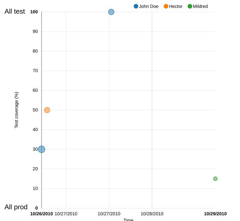
Now, at the same time colleague Pawel Badenski made a D3 solution that was much more impressive. Less lines of code and more elegant counts as ‘more impressive’ to many. Pawel’s version:
 (click to go through to the live app)
Back to now
So the new idea was to use D3 to chart multiple modules of Jest coverage over time. Then with Charlton Austin specifying and funding an UpWork contract, we thought we would see if we could get it delivered for $150. Here’s the repo with the solution jest-coverage-chart. The finished product is much more code than Pawel’s solution from way back. It is also missing some “select all” and “select none” that would be needed. It probably needs a rewrite to be more canonical D3. As it happens, Charlton was at the same client site in Wilmingon, DE, back when the “commit bubbles” work happened.
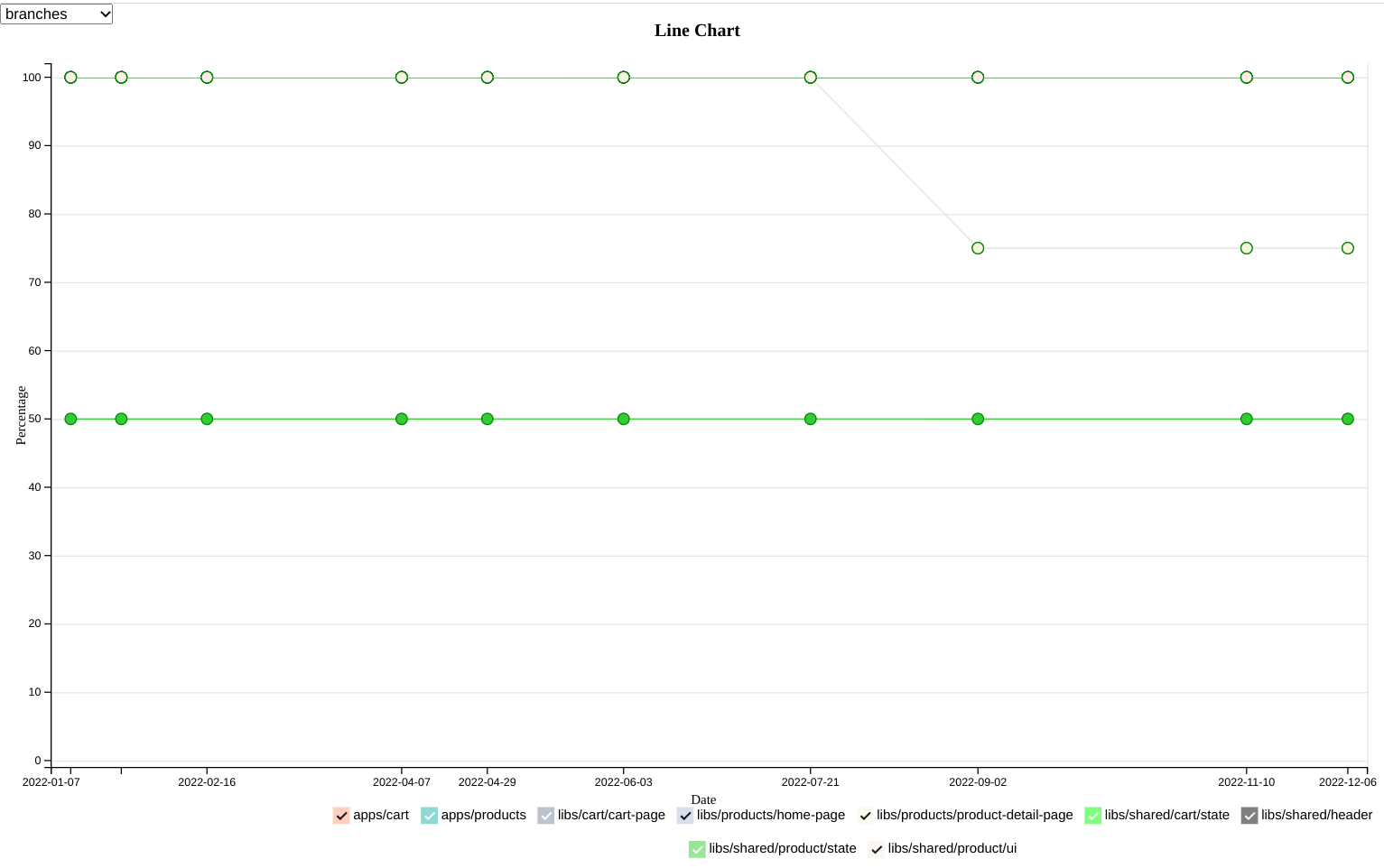
Here it the result for the Nx team’s nx-examples demo repo. Nearly all of 2022 is represented with intervals of a month between sampled commits (give or take):
 (Click to go through to the live app)
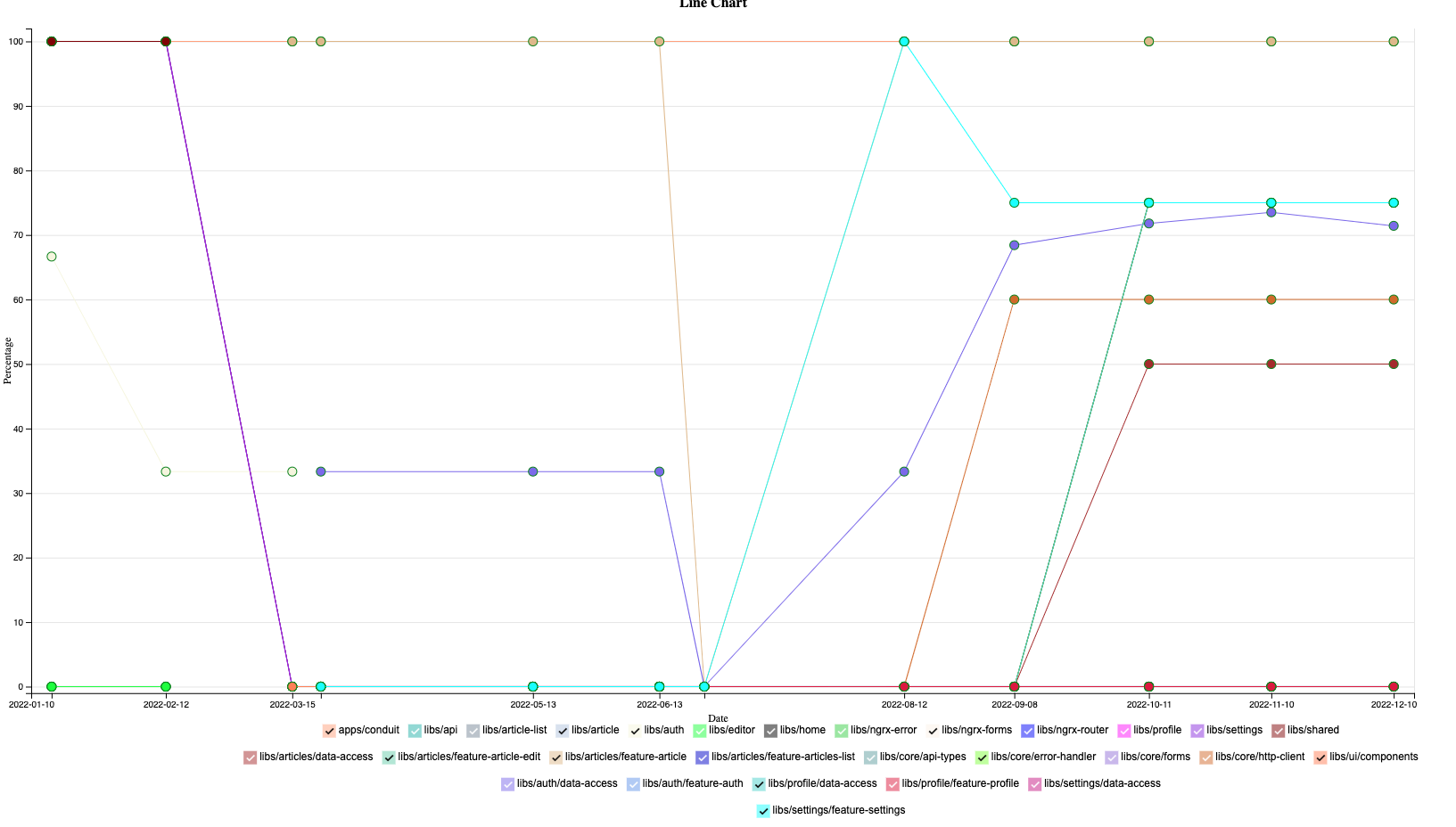
One more example for stefanoslig/angular-ngrx-nx-realworld-example-app:
 (no live app for this)
The tech to collect coverage over time is just some bash (in the repo README). Were the Nx team to reimplement this in TypeScript (they should), then it could be closer to utility a further from experimental than it is now. That bash is in the README for the repo, and would need to be tweaked for each repo it would collect data for (from/to dates, interval, branch name).
Ir you set this up for real it would not need to do this every commit. Maybe just daily. You could also down-sample to weekly datapoints and represent min/max/average as error bars.
A midnight cloud job would collect new data into bucket storage, then recreate the main JSON for the chart at the end. That would be from the collection of JSON docs already in the bucket plus the new datapoint. You could alternatively store the JSON back in the repo if you were happy for cloud jobs to do pushes to repos. Future audit standards might wish for coverage data to be stored in history-retaining merkle trees (Git) in order to prove correlation to code. As I blogged before.