Paul Hammant's Blog: Diagrams to help or hinder understanding
I always need a diagram to understand something. Sometimes I make the diagrams. For those, sometimes I’m the leader in the field, but more often I’m trying to make them for myself to understand something that pre-existed.
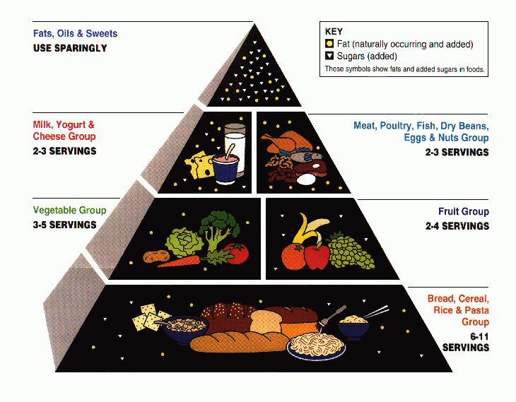
Food Pyramid
US Dept of Agriculture’s Food Pyramid (1992 to 2005):

USDA “My Pyramid” (2011)

So the newer one is garbage, as it conveys no simple idea. As it happens the old one was simple but not the best nutritional advice, so an upgrade was needed according to the USDA. The pyramid metaphor was powerful, so the new one had to fit that somehow which is why we have the MyPyramid mess.
Then again the Paleo/Keto/Primal communities would tell you that both are wrong if you want a long life (off-topic perhaps).
Cynefin
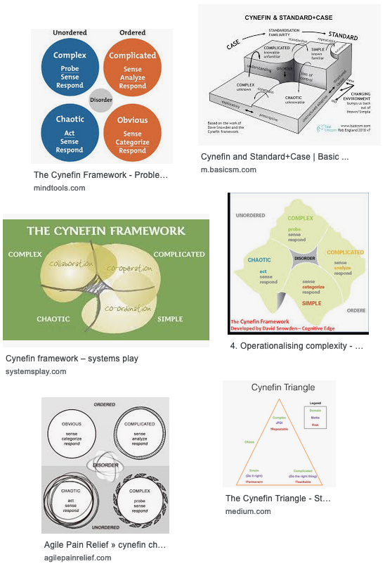
Most of my peers have grasped Dave Snowden’s Cynefin framework. Indeed some teach it (Jave Bloom, Liz Keogh, etc). Wikipedia for Cynefin. I’m stuck on the diagram though:
 .
.
My gut tells me there’s a better diagram that hasn’t been shared yet, and like a song stuck in your head, I keep looking at variants of this one and think “two hairy bums”. I’ve just completed three days at Lean Agile Scotland and it came up a lot. Amusingly, a genuine Scottish person quote/challenge I heard, was “I’ll cynefin you” (stylized threat).
In terms of education, I wish for some stylized examples. Say paining the kitchen, versus wall-papering or tiling. Indeed, these have changed in ease and finish over the decades so a 1910 and a 2010 edition might be fun. Same with fire as a tool for the average adult 200,000 years ago versus today. If time changes what’s obvious/complex/complicated/chaotic, then should that go in the diagram itself? Wardley Maps certainly contain a temporal aspect.
Anyway, if we look around for alternate depictions of the Cynefin framework via https://www.google.com/search?q=better+cynefin+diagram&source=lnms&tbm=isch, we see notable ones:

One of those hints at Venn, which I have an affinity to generally.
Stacey Matrix
(most notable alternate diagram)
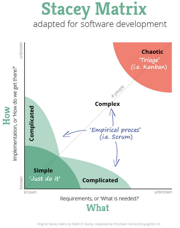
Ralph D Stacey came up with a model/diagram independently to Dave Snowden. Christiaan Verwijs has a Google ranked article that contrasts the two on LinkedIn. Dave Snowden commented at the bottom of the article, and I’ll not go into the more detail, so click and read if you an to. But the diagram is:

There is an alternative to the “What” and “How” axis labels out there: “low/high Agreement” & “low/high certainty”. I kinda like this diagram.