Paul Hammant's Blog: Application Development Glass Ceilings Revisited
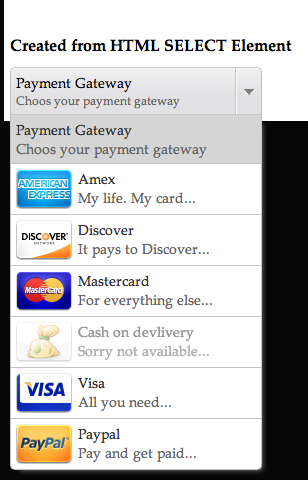
I had previous written something on application development glass ceilings. To describe this I have always used the lack of a ‘image drop-down’ widget as the proof of the glass ceiling when developing web applications. I’m going to get into an solution for that today.
Marghoob Suleman’s Javascript image dropdown
Marghoob Suleman’s has a reusable drop-down thingy that uses Javascript to add images to the options. It’s quite impressive. It replaces the <select> tag with his own hierarchy of <div> elements, and replaces the <select> tag within that so that <form> containers work correctly.
A demo
I’ve reduced Marghoob’s example to a single drop-down, and checked it into GitHub. It allows you to see the minimal version of an implementation (courtesy of GitHub Pages).

What Firebug Sees
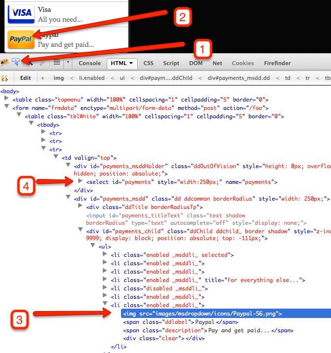
Crank up Firebug, expand the drop down, click Firebug’s select widget (1), click the Paypal image (2), and you’ll see:

The image in the DOM, is in blue (3).
Note the <select> element is now elsewhere (4), there’s a bunch of divs that are not there in the original source. It all works :). So we should always remember that the DOM is where the action is an that HTML is merely a way of shipping the UI to the browser. Quite that Firebug represents the DOM to us in a HTML style, was simply a choice of it’s developers (John Ressig). It’s really a live-mutating directed graph of nodes that the renderer traverses on one hand, and JavaScript (and human interaction) on the other. In fact you can see more of behind the scenes representation of the DOM if you click on ‘DOM’ in the Firebug tool-bar.
If HTML expands in the future to include ‘image drop-downs’, then this JQuery and CSS goodness goes away, and what’s represented in the DOM looks a lot more like the original source.
Feb 4, 2013: This article was syndicated by DZone