Paul Hammant's Blog: Angular for Designers.
I’m going to have another go at explaining one ‘best practice’ for AngularJS. I previously blogged about it here and here.
A colleague asked me “Is it about graceful degradation?”, and the answer is no it’s not. It is about the ability of a designer or a UX specialist to lead the behavior as well as the aesthetics of a web-application, during development.
A minimal Angular app, with an overlay
Take a look at this small app, with a button that triggers an overlay. It is best on a desktop, as the sizes are wrong for a hand-held device. Make sure to look at the source, and note that there’s just five lines of JavaScript. Granted, there are two ng-click expressions that are also JS.
Incidentally, I forked that from this article which claims to be without JavaScript, but that’s not true as there is JavaScript inlined in an on-click.
Note too that all the content for this app is static HTML. Normally you’d use Angular to bind in data from JSON. The two “previous blogged about” articles do just that. For this blog entry, I’m only trying to sell the view-all-panels-together aspect of the proposition.
Commenting out the Angular import

This is the big benefit for me. Designers, or indeed newbies to a project, will load up an Angular page in a running app with Angular turned off. They will then be able to see all the panels/divs/overlays concurrently visible within the page, whether or not the application would function like that. All will be very-nearly styled appropriately, as CSS will still work as it would in the final app.
Here is the same one-page demo as before, with Angular ‘turned off’. Note the ‘kittens’ button does not function.
Here is the source for it. I swear the only difference is the ‘script’ tag that would have dragged in Angular - I’ve commented it out.
Hacks I’ve had to do to make this work
‘overlayClass’ is one scoped variable that is only used once. It’s definition:
$scope.overlayClass = "white_content";
The place where it is used is the overlay div itself:
<div ... ng-class="overlayClass">
This is a hack that is needed. Here is what happens without it. Note that the second div is not visible (the button is still non functioning)
Here is the source for it. The only difference versus the previous one is the ng-class usage has been swapped ‘back’ to a hardcoded class=”white_content”, as per ordinary HTML usage.
This kludge is needed to support the design-mode I’m advocating for. At least, unless the Angular team make class vs style co-existence a little smoother :)
Other ‘new’ tools a designer would use
Tin.cr - edit your CSS while playing with a functional AngularJs app, and save directly back to the file-system (before doing a commit).
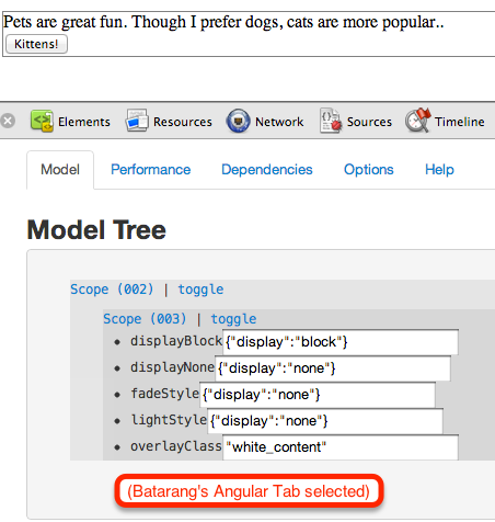
Angular Batarang - fiddle or inspect your Angular model in your running Angular app. Here’s that running:

A GitHub thought
Obviously I’m misusing GitHub here. I could have had three repos or three branches, and used GitHub’s own diff mechanism to show that the differences I claim, are the only differences. But for a few stymying factors - 1) you can fork your own repo, and 2) you can only have one branch that publishes to github-pages. I hope that one of the things those guys do with their $100m is enhance the capabilities of GitHub Pages :)
Syndicated
Nov 5, 2012: This article was syndicated by DZone