Paul Hammant's Blog: Angular Instead of Media-Queries
If you’re a developer or a UX person, unless you’ve lived under a rock for the last few years, you understand Responsive Web Design and it’s implications for site construction.
It’s clever stuff of course, and there are many examples of sites that adapt between desktop and mobile without a redirect. There’s also a backlash. I’m intrigued by that. I feel there is an element of “tail wagging the dog” about CSS driving more sweeping experience changes. I’m not sure CSS is the place for something that feels like conditional logic.
Tables, JavaScript and Angular
In a group activity at a GeekNight Meetup in Dallas on Wednesday, we took a stock GitHub Pages page & theme, and pared it down to be fairly minimal, and added in AngularJS and a spattering of form-factor detecting JavaScript to update some of the model variables. In the page, we bound some dynamic styling and if/else conditionals to the model. It’s just a hack really. Specifically:
- Whether the viewport size was best as a single ‘content’ column, or multi column: Navigation affordances in the left and right ones, and ‘content’ in the center
- The width of left and right columns being 15 pixels OR more that that, and implicitly how wide that central ‘content’ column is.
By the way, the source on GitHub is - https://github.com/paul-hammant/angular_instead_of_media_queries. The actual deployed site is https://paul-hammant.github.io/angular_instead_of_media_queries (be sure to try this on mobile devices as well as desktop … and try resizing the window).
There’s content that disappears from the left and right columns (as they get smaller). There’s also a point at which those columns function as margins (min width 15px). It all works quite well. The three columns are implemented in regular HTML tables. Yes that technology, that was superseded by <div> elements (and CSS) some ten years ago.
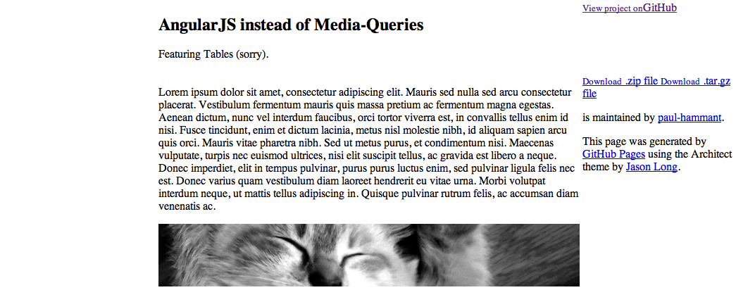
The page as we have it today looks fairly bad though. We detached the CSS that the GitHub Pages site generator gave us in the initial commit. We will add that back incrementally, as it’s likely that we don’t need all of it any more. We definitely want the fancy fonts and colors back. Where we started and where want to circle back re themes:
Where are now (1993 called and wants it’s style back):
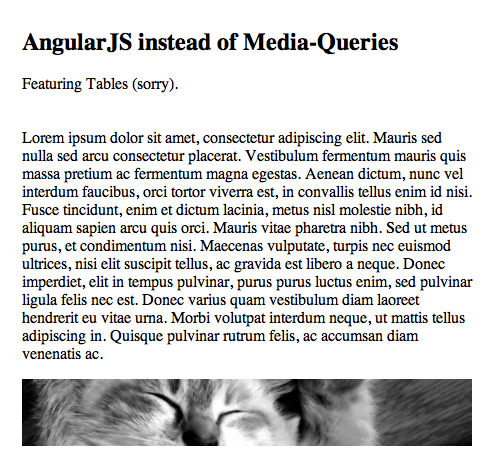
What that looks like if we reduce the size:
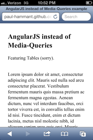
iPhone screenshot:
Yet to test / drilling into the code
How does google index this site? What does it look like in preview?
The Google search-bot has not found the site yet. I’ll update this blog entry when it does. Even if it did, Google’s search-bot is presently not going to load up Angular in a VM browser to take the screen-shot. It’s going to do screen-shotting (and indexing) with JavaScript turned off. Whereas normal Angular apps load JSON, we’ve deliberately chosen to have tactical Angular directives on an otherwise plain HTML page. This makes it eligible for search indexing.
The Angular attributes will be ignored by the search-bot. Take a look at the main source file and look for things prefixed with ng-. Specifically hg-hide, ng-show and ng-style. Here, let me do an ‘ack’ for you:
ph7785:angular_instead_of_media_queries paul$ ack " ng-"
index.html
2:<html ng-app>
28:    <body ng-controller="ResponsiveDemoCtrl">
31:                <td ng-style="leftMarginStyle"></td>
38:                <td ng-style="rightMarginStyle">
39:                    <a ng-hide="oneColumn" href="https://github.com/paul-hammant/angular_instead_of_media_queries" class="button"><small>View project on</small>GitHub</a>
43:                <td ng-style="leftMarginStyle" style="width: 40%"></td>
44:                <td ng-style="middleStyle" style="width: 20%">
91:                <td ng-hide="oneColumn" ng-style="rightMarginStyle" style="width: 40%">
OK, so that’s not 100% clear, so take a look in the source, and scroll around.
In order to help the Google search-bot and screen-shotter, we’ve also put in attributes of “style” AND “ng-style” on the same elements. That seems to be a conflict. It’s not. When JavaScript is turned on, Angular using the latter, will overwrite the former within a split second of page load. The former, however, is enough to make the preview screen-shot format OK.
I’ve also put the word ‘cachinnation’ in the page, so that I can search later for it in Google-Search. Well, search for “Paul Hammant cachinnation” perhaps. Cachinnation means ‘To laugh hard, loudly, or convulsively (guffaw)’.
Here’s what that preview screenshot looks like:
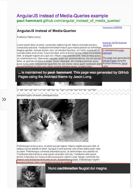
Looks OK, right? I’m not sure what’s happened to the left-hand column. Maybe the preview maker trims whitespace at the margins. By the way, it took the Google search-bot about seven hours to find it and make the preview picture.
Footnote.
There is some suggestion online that the word ‘responsive’ should mean Media-Queries solutions exclusively, so I’ve been careful to minimize use of that.
Feb 9, 2013: This article was syndicated by DZone